

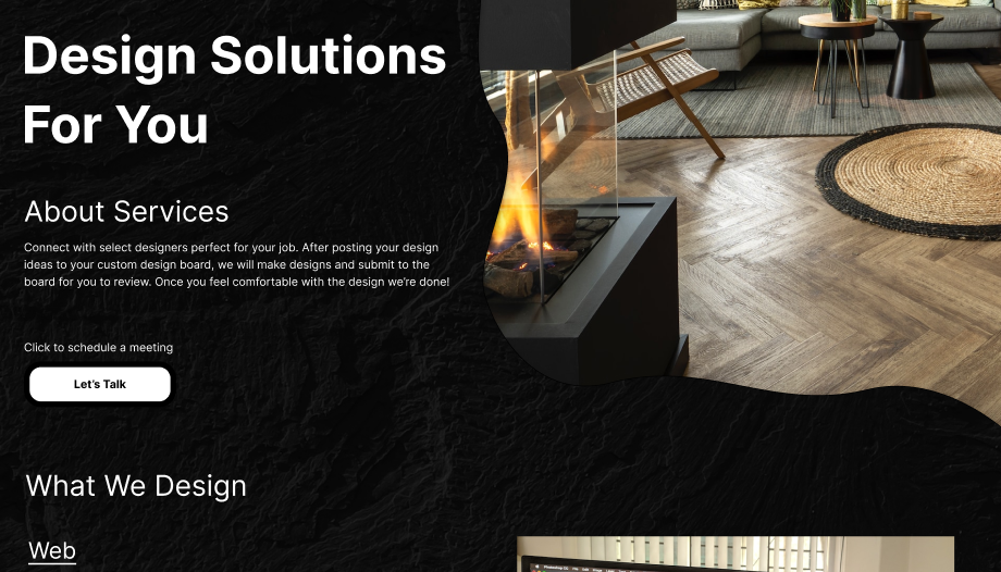
A simple design request system.
Overview
Summary:
Create a simple design request system landing page that meets accessibility standards as well as help designers & everyday people trust design based help.
Roles & Responsibilities:
Sole designer
Problem:
There isn’t currently a website so getting the landing page done was first step. Second was helping the landing page with trust so the user can respect and use the service provided.
Audience:
Designers & Civilians
Process
Discovery and Research
Summary:
Took user surveys and used competitor analysis. The finding drove me to find solutions to problems in user trust, landing site necessities, reasoning for certain features and user driven results.
User Survey:
This question was a 50/50 mixed result where 25% said yes, 25% said maybe and 50% said no. The next questions bring clarity as to why they chose these results but to summarize this helped be understand users have a huge need to understand how to trust design help.

With 75% of people saying “maybe” they trust design help and no one saying “no” gave clarity to the question above. 50% saying no was an opening that they may just not trust design help and need guidance on why they can.

User Pain Points:
- Design work not being good
- Taking too long to complete design
- Being scammed after spending money on service
- Not being able to trust service
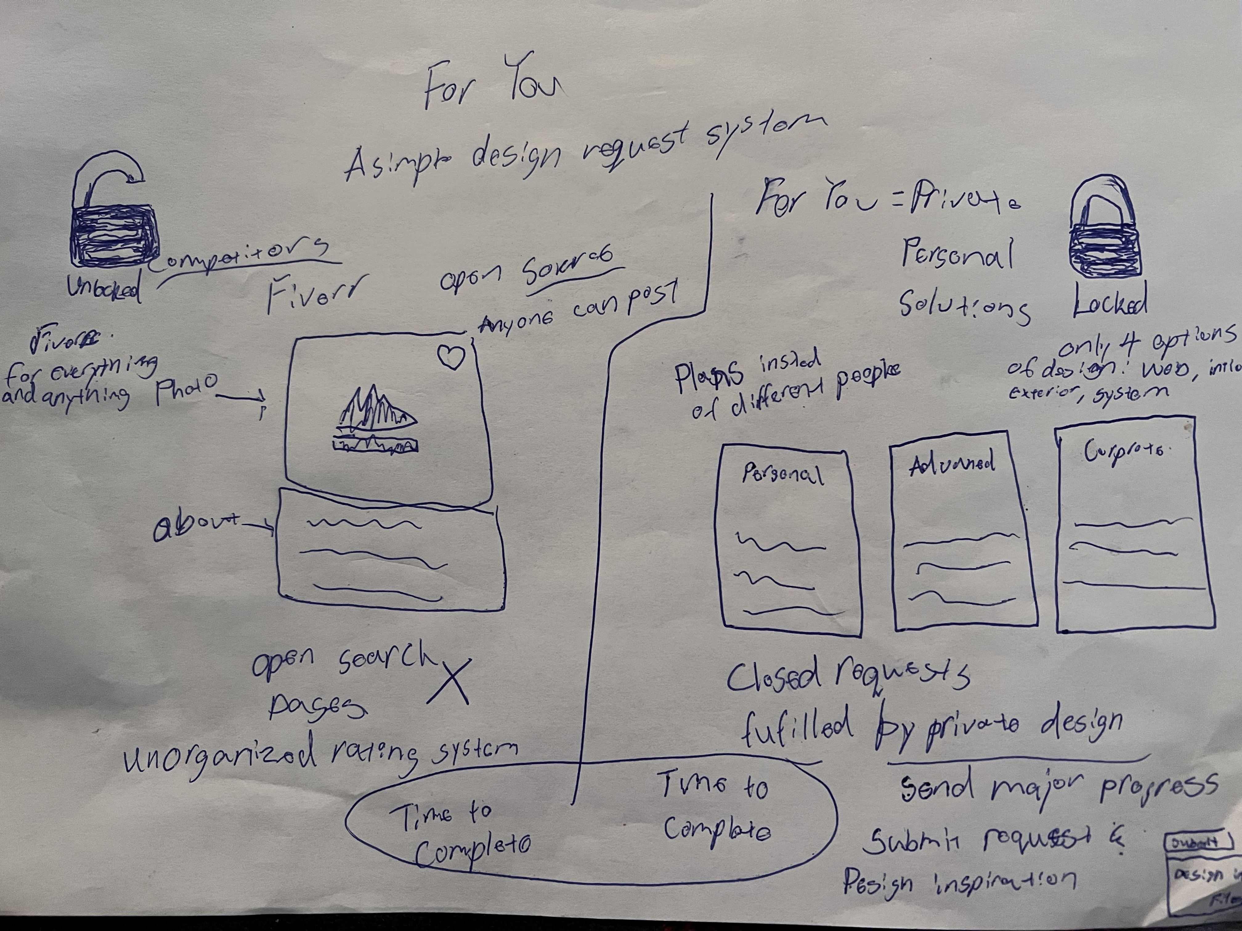
Competitive Analysis:
For You has 3 competitors Phenyx, Fusion 360 & Avalaunch for analysis.
Phenyx:

Phenyx was great coloring, very similar to the brand colors of For You. The top menu bar is a bit intrusive. There’s a circle saying “our work” which I understand is a button but I doesn’t look like a standard button. Overall Phenyx wins in coloring which will be used in the website.
Fusion 360:
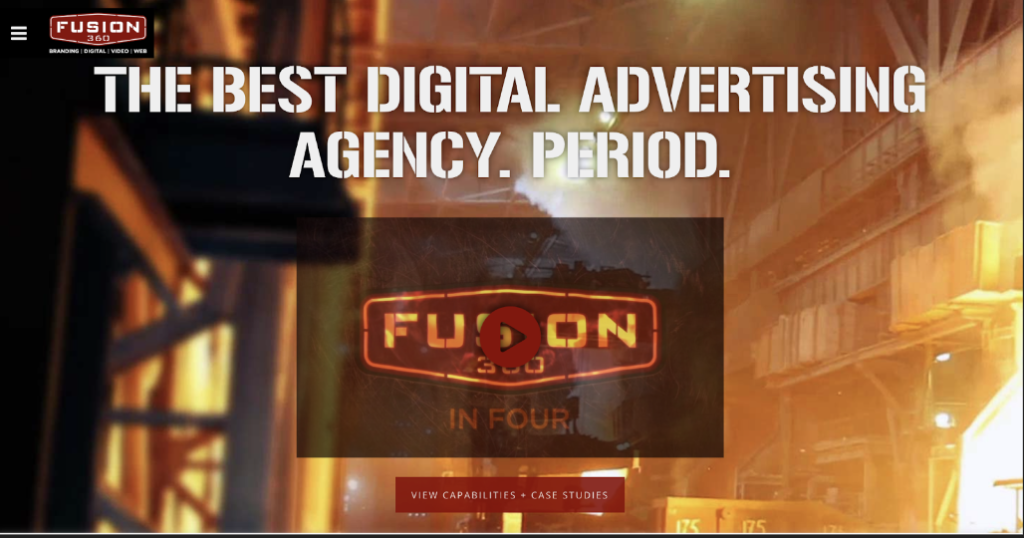
Fusion 360 has a huge hero but one thing that stood out was the orange and black. These color choices didn’t feel too accessible. Another stand out was the logo with text underneath felt condensed. Overall the site felt loud and like they don’t exactly know what they do unless you just need ads that make noise. This was helpful in designing For You, making sure its made quietly and professionally.
Avalaunch:

With a great “trusted by” section, Avalaunch made a great competitor to “For You”. Trust is a big part of this project and seeing how others obtain it is vital. The logo positioning and size was also notable. Having a white background did not match the theme requirements. The menu section was also a bit over developed when it came to designing for simplicity.
User Personas:
Ella Bello is a designer by trade.

User Journey:

Zoomed for viewing:


Information Architecture
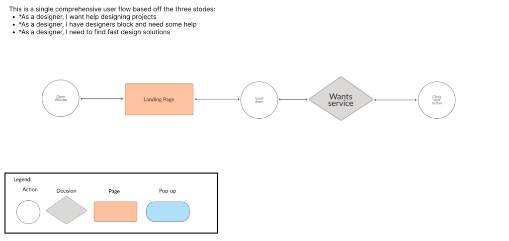
User Stories:
- As a designer, I want help designing projects
- As a designer, I have designers block and need some help
- As a designer, I need to find fast design solutions
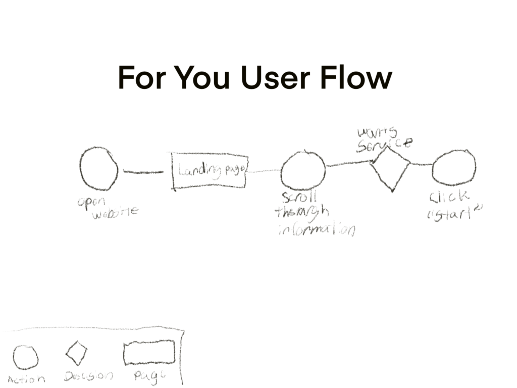
User Flows:
For You has a single page scroll for site which highlights every user story. This made creating a user flow easy because each story is met by the same resolve.

Flowchart:
As the user stories were already compressed into a single user flow, I then digitized the flow into a flowchart for better viewing.
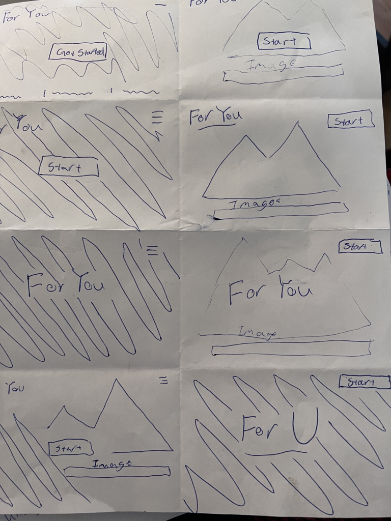
Wireframes:
Early on there were differences on how the shape of the site worked and placements of components. Over time, research and user tests the wireframes of For You progressed into a user friendly, accessible, and trustworthy site.


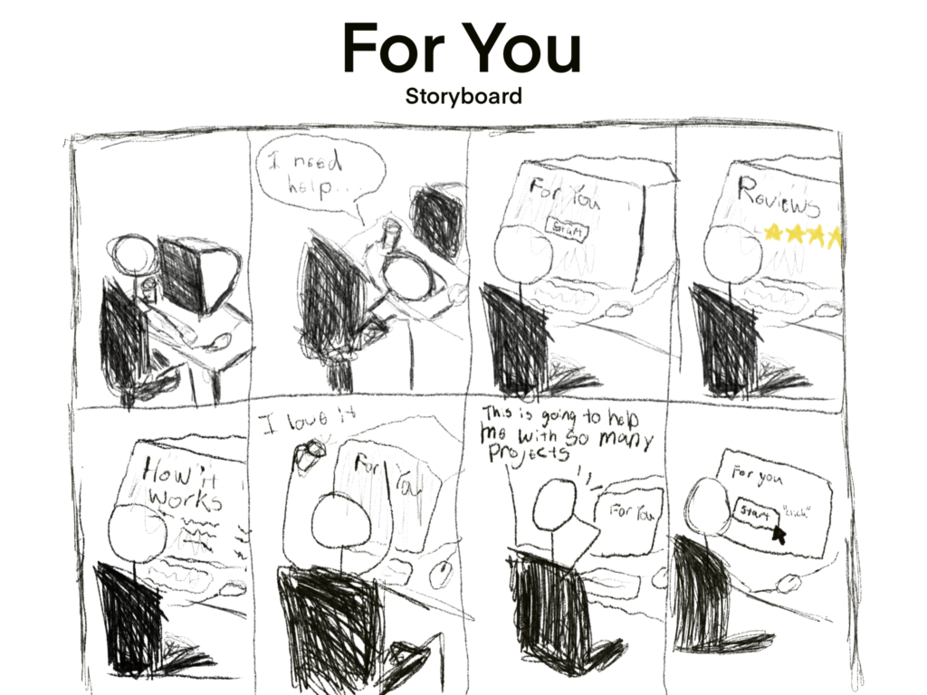
Paper Prototyping Early Research:
Based on surveys and competitive analysis these paper prototypes were the solution to finding what our demographic of users pain points were and successfully used these drawings to find out problems.
Brand Development
Brand Personality:
Cold and trust worthy, knowing you will get the help you desired at the quality and time we agreed upon. Easy to use and repetitive use suggested. Nothing quite feels like the personableness from For You.
Moodboards:

Sketches:
Logo:
The logo was predetermined and is the name “For You” in bold Inter font.

Color Palette:
With a AAA standard and the companies colors already being black and white, meeting accessibility guidelines was definite.

Typography:
Font: Inter
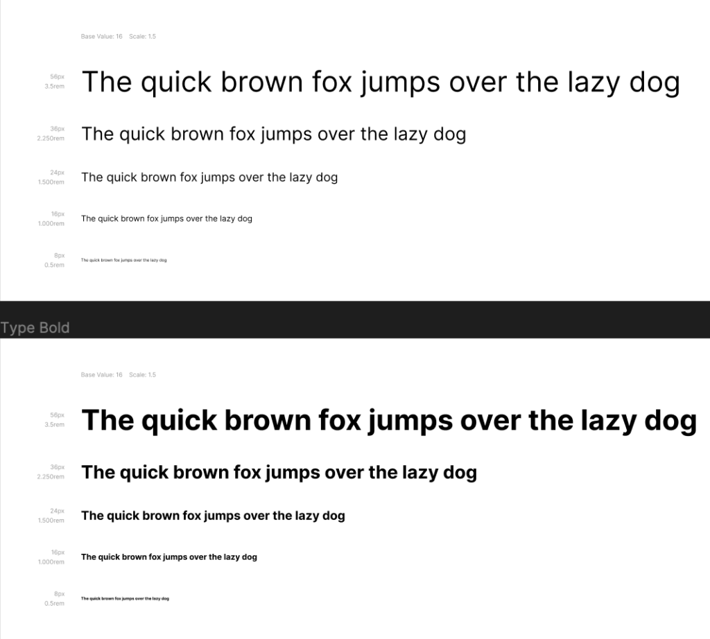
Style Guide:
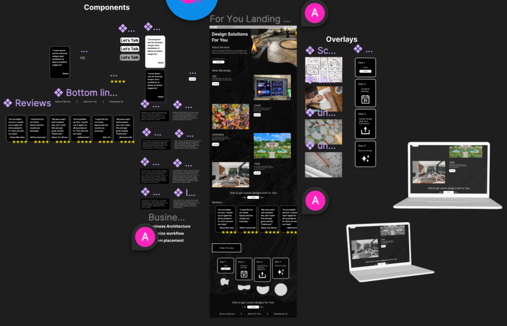
For a style guide For You used a custom components library with every component, color and typography style. Using this was way easier than creating, coloring, and styling each individual piece.

Prototyping
Clickable Low-Fidelity Prototype:
Sketches turned to digital and clickable for users to test. This helped bring the new design forward. A great learning experience.
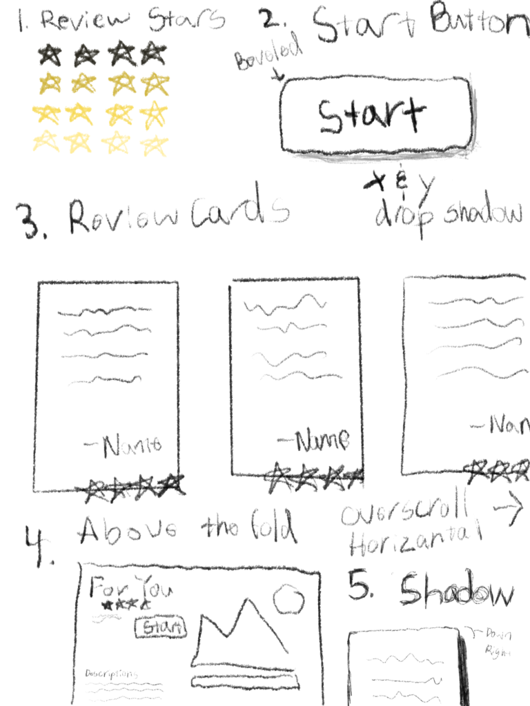
Iterations Of Design Prior To Usability Testing:
Snap shots of every major iteration change. Each one built better by the user tests that followed For You.
“How to use is confusing” is a user suggestion based on tests. Simplified the list and moved it to the bottom. This helped users who have reached the bottom of the page and still unsure what to do.
Example of change:


“The white on black is to bold” “drop shadow makes it look clickable” is another user test after submitting the iteration to users. Changed to a slim streamline of reviews which helped the users eyes and focus more on the reviews and less on the component piece.
Example of change:


Usability / Preference Testing With Results:
Most of the major steps taken are recorded here. The design changed and formed due to user testing.
How it started:

How it ended:

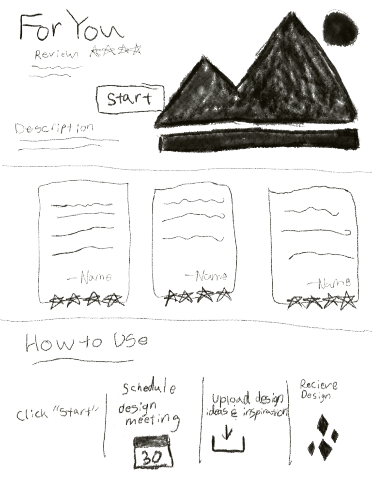
High-Fidelity Prototype:
It took a lot of user testing and research to get the the goal of a high-fidelity prototype. The end result is amazing and a tribute to the users who built it.

Final Thoughts
Successes:
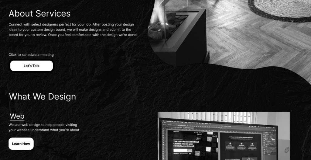
Created a landing page filled with components that help the user feel trust and support using the companies services.
Learning Opportunities:
Allow for more flow when it comes to Information Architecture and finding where the users eyes gather.
What Was Learned:
How to create trust in a site using three things: what we do, reviews & how to use. For You was able to create a bond and trust with initial users who are interested in the services.
Mistakes Made:
Missing opportunities to record findings and organization. In the beginning of the project there were many changes but iterations were not recorded until mid way. With better organization I can solve this issue and have since implemented methods to help.
Contact:
Leave a Reply